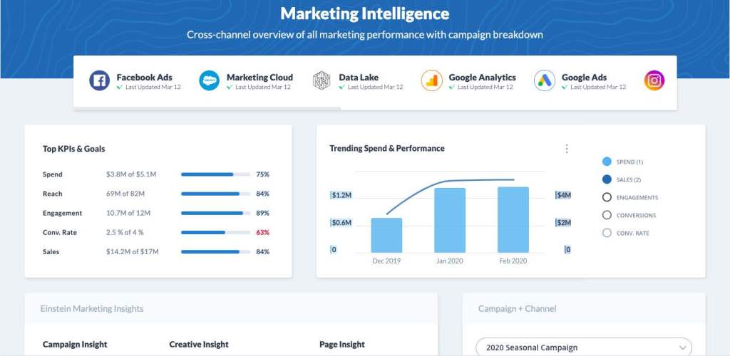
With the constant deluge of change combined with the increasing needs of the communities we serve, metrics can act as a north star for nonprofit strategy and bring some calm to the chaos around us. They help your organization be more agile, uncover powerful currents of success, and see choppy waters to avoid stormy waters. Hope you like the seafaring theme thus far, it could be replaced with any journey analogy though.
With limited resources, measurement is foundational to benchmarking different options, helping you prove and improve your mission. Nothing speaks louder than objective data in making decisions. Measurement is also the basis for Return on Investment (ROI), which you need to justify the resources you need to run your nonprofit.
But will good data and Key Performance Indicators (KPIs) alone steer your ship/organization?
Not really – your staff and stakeholders do – but metrics are your map. Metrics represent your community and the people you serve, your staff, and how they work towards your mission’s impact. No one likes being reduced to a number, so every time you’re looking at a graph, let the right side of your brain weigh in too.
Here are some examples of what metrics represent:
- Common definitions, democratized data, and universal access create a culture of performance measurement, trust, transparency, and accountability – data is a language.
- Supporter metrics or a simple survey can help create empathy for your team to move to a more supporter-centric mindset – data reflects your community.
- Team metrics can unlock insight into how your fundraisers are working (hopefully happily and productively) from home – data is your staff.
- Metrics can be shared in conversations/chats to innovate or to kick off a workflow that used to take you hours to complete – data works for and with you.
This article covers performance measurement in Nonprofit Fundraising & Marketing, with a goal to help nonprofits fund solutions to the ever-changing needs of our communities.
You might ask, why not write about impact measurement? We believe in the power of programs and impact data and have many other resources on that topic. There is already a history of “proof” in program outcomes due to its funder requirements and its operational nature, however we have heard from marketers and fundraisers they are being asked to prove their work.
Revenue-generating teams can also be treated differently if they use these metrics to grow. If you invest in overhead or top-line growth, you can be chastised as “not a not for profit”. However, fundraising is the lifeblood of the programs that drive your impact, and in a recession these funds are mission-critical.

I’ve had the privilege of working with many fundraising leaders. The best fundraising leaders are experts on their performance metrics and prove how one dollar invested turns into more than that dollar. The deep understanding of ROI, in particular, makes it much easier to pitch for more investment, which they confidently know will have a high return.”
– Paul Matthews-Brokenshire
Industry Solutions, Salesforce.org
What are Nonprofit KPIs?
In the sea of data, there’s an unlimited number of metrics to track. Be ruthless in the prioritization of Key Performance Indicators. There shouldn’t be more than your organization can digest.
To help you, we’ve created a simple way for nonprofits using any CRM or marketing technology to export their data to better understand their KPIs, below. If you are using Salesforce for Nonprofits and the Nonprofit Success Pack, you can scroll down to use Tableau for this analysis.
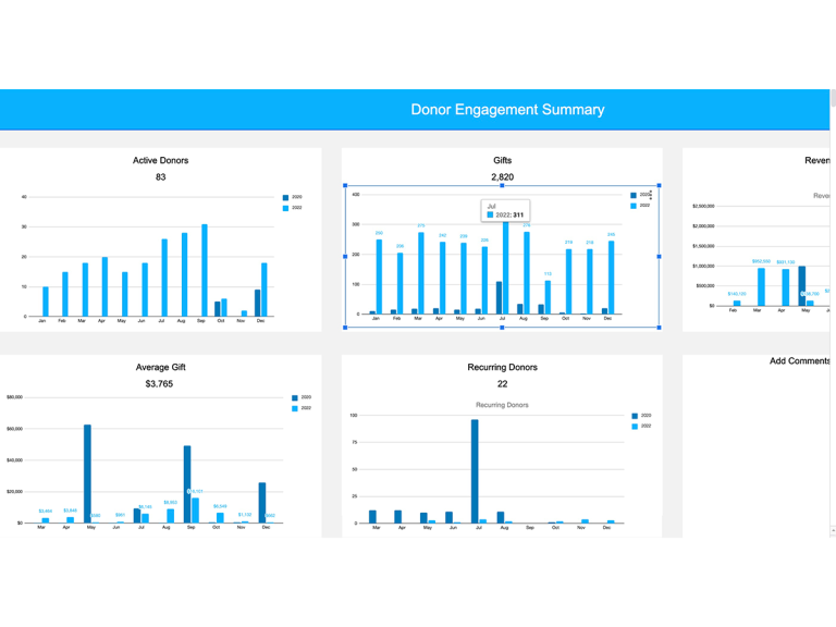
Download the Nonprofit Performance Workbook
Export your data to track all your KPIs in this Spreadsheet, with visualizations on Tableau.
Commonly Asked KPI Questions:
- What should you track? Agree on goals/priorities then KPIs you should pay attention to
- What if we don’t have goals? Use metrics to create and test your hypothesis for strategy
- How are they calculated? Usually simple equations consisting of multiple data points
- What can you do with them? Benchmark your progress, identify trends over time, kick-off workflows, etc.
- Who should track them? Everyone! But have a business analyst or go-to data person too
- Where do they get them? Digitized in reports and dashboard, and hopefully not manually
Organizing metrics are also important, as every KPI is a metric, but not every metric is a KPI. The few KPIs that you measure should be tied directly to organizational strategy, typically through a goal-setting framework. At Salesforce, we have a process that is adopted by many other organizations, called V2MoM (Vision, Values, Methods, Obstacles, and Metrics). Other organizations use things like OKRs or objectives and key results.
| Description | Why It’s Hard | |
|---|---|---|
| Goal (North Star) | A future outcome, measured using data below | Goals keep changing, or there are too many. |
| Key Performance Indicator (AKA Steering Metrics) | A consistent set of different metrics to measure performance | Not easy to measure/attribute to goals, can be historical vs predictive, leading you to look backward |
| Metric/Measure (Calculated from Data) | Any data point that tells a story or helps you understand something | We sometimes can’t see the story in the data, or are missing metrics |
| Data (Foundation of Everything) | Factual representation anything, many times numbers, in a digital world | Getting it on one place, kept up to date |
Why are Nonprofit KPIs Important?
We know that most nonprofits professionals care about this topic of measurement through our own data-driven research. This is one of the areas we research, and people consistently respond feeling they could be doing a better job.
-
#1 Priorityfor Marketers is improving marketing ROI/attribution.
-
31%of nonprofits are able to accurately forecast revenue from fundraising campaigns.
There are endless use cases for metrics and the underlying data that supports them. Let’s focus on a few categories, with specific examples of how you can shift your teams to be more data-driven.
- Strategic Prioritization: With every decision, focus on a single north star by making data-driven decisions.
- Justification: Get leadership and board members to see the brightness of your new north star
- Investment Asks: Get more rowers/oars, a better boat, or new engine (aka technology)
- Tactical Direction: Show marketing teams how to row faster in the right channels, or fundraising teams how to focus on the right donors
- Motivation: Energize your fundraising and marketing teams by illustrating how their inputs ladder up to overall goals, so they row in the right direction
- Trust: Build transparency with all employees with access to good data that lets them stop guessing
- Hygiene: Get your teams to swab the data-deck 🚢 by showing them how dirty it is
Each use case has different stakeholders, requirements, and levels of detail they need. So for each dashboard, you create, think of the end-user, and how it will be presented in a talk track, or digested later.

Customer Story
When you think about justifying the spend, you essentially are journey mapping an experience for the people you want to weigh in. For example, if you want a board member to buy in, you need to understand their needs, and present the KPIs in that flow of the story.”
– Bonnie Beauchamp, Business Analyst, Atlanta Mission
3 Dashboards with Types of KPIs & Definitions
Saying we’re in “unprecedented times” now sounds like a broken record. Change has accelerated in climate, politics, war, health, technologies, regulations, privacy, security, stakeholders, staff skills, communication channels, and everyone’s expectations. All these winds of change are gusting in different directions, so if you change your course to try and catch every gust, you might end up with baffled sails and staff or just end up going in circles with staff throwing up.
Here are three dashboards with metrics you can use tomorrow, with real-time data at your fingertips through any of Salesforce’s analytics capabilities.
Join a Training Session on Visualizing KPIs
Join a hands-on session to learn how to unlock the power of data by automatically computing Fundraising & Marketing KPIs and visualizing data on Tableau.
Dashboard 1: Supporter Engagement & Giving Metrics
There are a whole host of metrics and KPIs you could use to better understand this supporter view. Across our customers from both the nonprofit and the corporate worlds, the most successful ones know the financial and strategic value of each step of their supporter’s or customer’s lifecycles, along with the KPIs that underpin them. This acts as the foundation of their decision-making, and most take a long-term multi-year approach to measurement, ideally 3, 4, or 5 years, but sometimes longer.
Supporter Engagement & Giving Metrics & Definitions
| Metric | Definition | Calculation |
|---|---|---|
| 5 year Lifetime Financial Value | Cumulative Net Value One Supporter Gives Over a 5 year Period | [Sum Revenue – Sum Direct Costs to Recruit and Develop Donors] / # Donors |
| Revenue Per Donor | Revenue For Each Donor Within The Defined Time Period | Sum Revenue / # Supporters who donated within the time period (eg. month/quarter/financial year) |
| Average Gift Size (AG) | The Mean Average Gift for defined co-horts of supporters (usually to time periods and/or by channel and activity) | Total $ Revenue / # Donations. Tip: mean can be heavily influenced by outliers. Use mode/median to understand whether the mean has been impacted heavily by large (or small) gifts |
| Cost Per Dollar Raised (CPDR) | How much it costs to raise each dollar of revenue within certain time period and/or by certain channel/campaign or fundraising activity | Sum Cost of Fundraising Activities / Total Revenue Raised |
| Donor Acquisition Cost (DAC) | How much it costs to Recruit a New Donor | Direct Costs (eg media, creative) / Total # Donors Recruited |
| Active Donors | The number of donors who gave at least one gift in the specified time period | Sum of # Donors who gave a financial gift within the specified time period |
| % Retention Rate | % of Donors who gave across defined time rates (eg. month/quarter/financial year) | # Retained Donors / # active donors who gave in first time period |
| # Retained | Number of Donors who gave across defined time periods | # Active Donors from the first time period who gave again in the subsequent time period. (eg. FY’20 and FY’21) |
| % Attrition Rate | % of Donors who did not give across defined time periods. For example gave in FY20 but didn’t give in FY21 | # Attrited donors in second time period / # Active Donors in first time period |
| # Attrited Donors | Number of Donors who gave in first specified time period but not in the second subsequent time period. | # Active Donors from the first time period who didn’t give again in the second time period. |
| # New Donors | Number of Newly Recruited Donors in defined time period | Donors whose first financial gift was within defined time period. |
| # Regained Donors | Number of Donors who gave in the latest time period having missed giving in the previous time period. For example: first gave in FY19. Didn’t give FY20. Gave again in FY20 | # regained donors in existing time period / # active donors in the time period |
Prioritization & Visualization
Prioritizing 3 to 5 primary KPIs will give you a valuable guide to inform decisions and communicate successes to stakeholders. A good start would be to set as your KPIs Revenue per Donor, Donor Acquisition Cost (DAC), Retention Rate, and Attrition Rate. These metrics provide solid signals of whether your strategy is going in the right direction. It is also important to understand the interplay between metrics. For example, a decreasing DAC is not necessarily a good sign if your retention rate and your revenue per donor are also decreasing. You could just be recruiting a poorer quality of supporter or it could be a sign your retention activity requirements improvements.
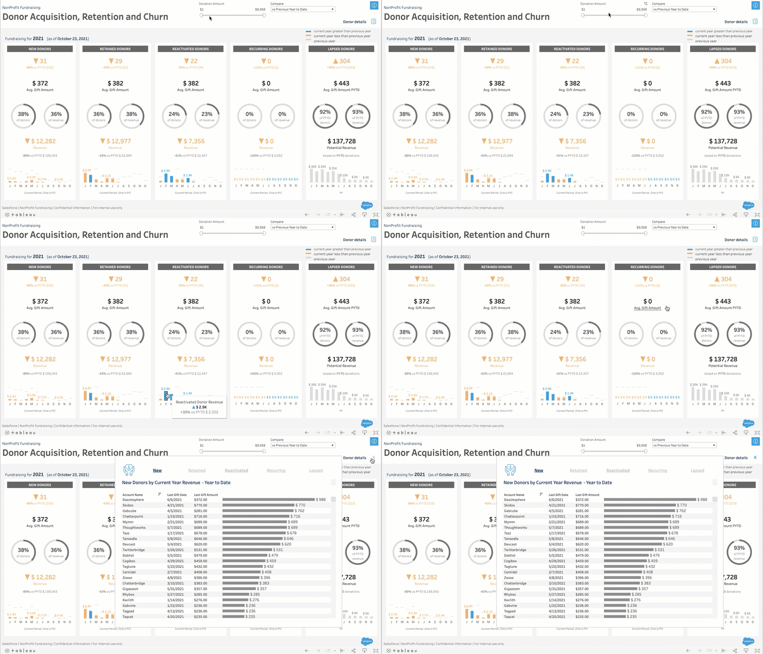
Click here to connect Tableau to the Nonprofit Success Pack.
Primary KPI: Donor Lifetime Value (LTV)
Many marketing experts believe Donor Lifetime Value is the one north star in stormy waters and a tool to guide everything. Think of lifetime value as the engine room that runs across fiscal years – the more you build the value of each supporter over their lifetime with you, the more sustainable your growth will be.
However, calculating LTV can be difficult. You can use the sum of a donor’s lifetime giving for historical data, but predicting future value can be tricky. Some of the most sage advice on this topic for nonprofits is provided by Adrian Sargeant, an academic who has contributed vastly to the development of the profession of philanthropy. See more resources of his in the appendix.
Start Simple and Work Towards LTV
It is possible to set up simpler proxies or alternatives to lifetime value that can still go along way to developing this critical long-term supporter value view. Good examples include:
- Revenue per Donor calculations
- ROI calculations by cohorts of supporters recruited each financial year via your acquisition channels, and what value each cohort will achieve over 3 – 5 year time frames
Tip: Use historic performance of a cohort to inform forecasting models to project what the latest fiscal year’s cohorts will achieve over the next 3-5 years.
Example: Major Donors
Some high-performing teams have objectives tied to metrics such as the number of key interactions or key conversations they should be having with prospects each week, month, and year to move these supporters through the classic moves management approach.

Nonprofits need a deep understanding of metrics and what they mean to inform all decisions: from which acquisition channels to focus investment on, which segments teams should prioritise, where to unblock the pain points in the supporter journeys, to what timeframe to forecast future growth. It’s really part of every conversation.”
– Jane Trenaman, Industry Advisor, Salesforce.org
Dashboard 2: Channels & Campaign Performance
Who doesn’t like the good news from the End of Year or Giving Tuesday campaign? These metrics are great team wins, as both marketing and fundraising teams play a part and therefore can share in metrics that roll up to KPIs.
Also, the costs associated with these campaigns can be easier to measure than with frontline fundraising activities (where costs primarily include staff time and compensation). This common view of how marketing and fundraising teams are working together can build trust and a culture of measuring success.
Atlanta Mission Marketing & Fundraising teams at Atlanta Mission collaborate on the experience for different donors, but also share measurement.
Learn more in the Trail Guide to More Personalized Communications Session 1 & Session 2.
Channels & Campaign Performance Metrics & Definitions
All of these metrics can be grouped by campaign or channel.
| Metric | Definition | Calculation |
|---|---|---|
| Total or Gross Revenue | Total of all financial gifts given to the channel/campaign | Sum of Revenue |
| Total Cost/Spend/Investment | Total of the direct costs used to deliver channel/campaign to supporters or prospective supporters | Sum of Cost |
| Net Revenue | Total Net Revenue secured from channel/campaign. Tip: Split out acquisition channels from results of the same channel to existing supporters. Depending on your country acquisition channels can recruit at a loss and take a # months to breakeven, so it’s important to look at acquisition channel performance over a 3 to 5 year period t | Sum of Revenue – Sum of Cost |
| Cost Per Acquisition (CPA) | How much it costs to recruit a new name to your database | Direct costs (eg media, creative) / by total # people or campaign members recruited |
| Donor Acquisition Cost (DAC) | How much it costs to recruit a new donor | Direct costs (eg media, creative) / by total # donors recruited |
| Cost Per Dollar Raised (CPDR) | How much it costs to raise each dollar of revenue within certain time period and/or by certain channel/campaign or fundraising activity | Sum of Cost of Fundraising Activities / Total Revenue Raised |
| # People Sent/File Size | # people who received the marketing channel/campaign | Sum of # people or campaign members |
| Response Rate (RR%) | What percentage of the file gave to the marketing channel | Sum of # people who donated / # people or campaign members |
| $ Per Donor Per Campaign | How many dollars given by each donor that responded to the channel/campaign | Sum of total revenue / # people who donated for a certain campaign |
| Average Gift Size (AG) | The mean average gift for the marketing channel/campaign | Total $ Revenue / # Donations per Channel |
| Total Donors | Total #donors who gave to the marketing channel/campaign | # Donors |
| Total Gifts | Total # gifts received to the marketing channel/campaign | # Gifts |
| Cost Per Message Sent (CPMS) | Calculates the cost, typically of paid communications | Sum Cost / Messages Sent |
| Click Through Rate (CTR) | Percentage of people who receive a message (opened) and then clicked through to call to action (CTA) | # Opened / # Clicked |
| Conversion Rate (CR) | Percentage of people who converted into a donation | # Clicked / # Donated |
| Return On Ad spend (ROAS) | Return on Investment for Paid Ads | Revenue / Advertising Costs |
Prioritization & Visualization
The more rigorous you are in using metrics to guide your decision-making, the more you will be able to prioritize your time, effort, and marketing spend.
When selecting metrics, make sure they are relevant to your goals, and organized with the end in mind. For example, if budgeting for End of Year, you might want to dig into historical performance, benchmarks, and return per channel (in Salesforce this is Campaign Type) last year versus this year. End of Year campaign has many moving parts, so using campaign hierarchies can help you keep track of all aspects of a campaign and channel performance.
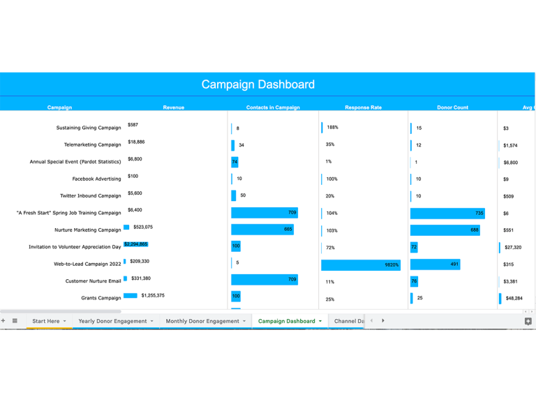
Where should you measure these metrics? CRM? Marketing System? Business Intelligence? Yes to all, depending on your need. Marketing systems will typically hold more engagement data than your CRM, but most data should be passed through to your CRM, making it easy to track conversion to dollars. Your CRM data can also be visualized using a Business Intelligence tool such as Tableau. Here’s an example:
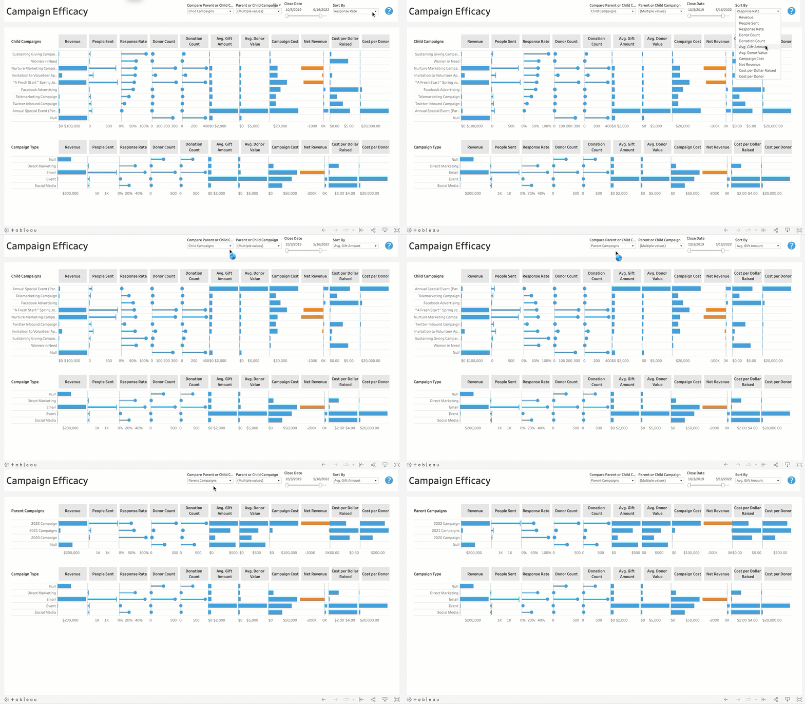
Click here to connect Tableau to the Nonprofit Success Pack.
There are also more robust tools built for marketers that aggregate disparate systems, connect all of your channels, and help you understand your marketing performance, such as Datorama.
Example: Emergency Appeals
A classic example can be emergency appeals. Like many fundraisers, we wish these weren’t necessary but public support is so critical during a time of emergency. Emergency appeals can recruit a high volume of single givers via digital channels and make a positive uplift to fiscal year gross revenue, the cost to income ratio, return on ad spend (ROAS), and acquisition channel performance in the year. However, unless your donor onboarding is very good, these supporters can be difficult to convert to long-term, repeat giving patterns.
Dashboard 3: Planning & Forecasting
The world is heavily unstable, and no one can say what will happen tomorrow, other than it won’t be today. We want to help you spot future funding risks or opportunities with less foggy glasses, to make that leadership or board meeting a bit more of a breezy sail. At the same time, you can also use this data to drive team productivity and actions based on a clear future vision.
Planning & Forecasting KPIs & Definitions
| Metric | Definition | Calculation |
|---|---|---|
| Total or Gross Revenue | Total of all financial gifts given over a period of time | Sum of Revenue per period of time (can be per Channel or Donor Type) |
| Total Cost/Spend/Investment | Total of the direct costs used to deliver channel/campaign to supporters or prospective supporters | Sum of Cost per period of time (can be per Channel or Donor Type) |
| Net Revenue | Total Net Revenue secured from channel/campaign or activity | Sum of Revenue per period of time (can be per Channel or Donor Type) |
| Revenue Goal | Targeted goal or forecasted amount over a period of time (can be per Channel or Donor Type) | Sum of all Revenue Goals $ |
| Revenue Plan to Date | Sum you would raise in period of time (eg month) based on board approved plan | Sum of Plan Over Period of time |
| Actual Revenue to Date | Where you are with won gifts | Sum of won gifts |
| Actual Current Variance | Where are fundraising versus your targets | Total cash raised – Revenue Plan Target for period of time (eg. month, quarter, FY) |
| True Variance | Unplanned gifts plus the amount of variance in received gift minus lost gifts. | Unplanned gifts + Sum Amount of Variance in Received Gifts – Lost Gifts for period of time (eg. month, quarter, FY) |
Prioritization & Visualization
Forecasts help you predict future performance and revenue as best as humans can, with the help of good processes supported by technology of course. Forecasting long term can spot macro trends, like annually planning with the board, or drive short term results, like a monthly forecast combined with an inspection of your fundraising team’s activities.
An effective forecast not only plans for the future but also ensures you are heading in the right direction at any moment, and small enhancements here can return drastic results.
Like with all metrics, a structure of how you measure, and when you do this is critical. Make sure every opportunity is connected to a single fiscal year/quarter and use campaigns to organize these gifts into more detailed categories.
Example: Planning
You can forecast top-down where you say “we need $1M for a new program” and spread the revenue needed over a forecasted period of funding time. It’s a great way to outline what you need to manage and expand your mission but can be difficult to achieve, and sometimes projects feel more like hope casting.
Top-down thinking doesn’t help you think through 1) how you will get that funding or 2) if you can achieve that goal with bottom-up forecasting on historical data.
That’s where a bottoms-up approach can be helpful. Visualize last year’s major campaigns’ and appeals’ start and end dates on an X-axis, with corresponding revenue on the Y-axis. Discuss what worked, what didn’t, and what you will do differently this year. What can you lean into to get that $1M? Can you run a successful campaign twice, or do you need a new revenue source like a grant? Some major KPIs to look at here are your revenue projections over any period of time, forecast goals, and variance.
The people who can best judge whether a gift will close are the ones closest to the relationship. During annual planning:
- Review a in software or a spreadsheet of last year’s gifts and mark those you believe will be renewed in the next fiscal year
- Enter in potential new gifts from new and existing supporters
- Review list of all expected gifts for the next fiscal year
Note: Often there will be some gap that you should expect to be covered by unplanned gifts so the forecasting process can be balanced based on this or left to fill out over time.

Customer Story
We have a very collaborative planning process, which is personalized to our needs through a few planning fields we added to the opportunity object. Salesforce makes it easy to track where we thought we would be at a certain date AND why we might be ahead or behind those results. Specifically, by running some simple reports based on the planning close, the current close, and the current date – we can easily create a set of reports to show how gifts have moved around. The result is I can show everyone where we are heading.”
– Nate Marsh, Director of Data, Thrive Scholars
Example: Gala
Planning can be a challenge when your marketing and fundraising efforts are not forecasted together. For example, can you forecast what you’ll bring in from your Gala in online fundraising via live stream, in person at the event, sponsorships, and major giving? Do those teams know what they will contribute to that forecasted amount?
If you have set up a campaign hierarchy properly, you should be able to produce a forecast that shows everyone their respective metrics for the expected results of the event, with each group knowing the underlying activities that will get them there. If you did it last year or for similar events, you now have benchmarks to discuss if you might see similar results.
How to Be More Data-Driven
We know this is a lot of information, but we hope it does a lot to help you move in a more metric-based approach to performance.
Start Where You Are
You have data today. Start with what you have….and take a step at connecting data. That could be across the use cases we spoke about or others like:
- Team Management & Productivity
- Employee Satisfaction
- Recurring Giving & Upgrades
- Data & Forecast Cleanliness
- Donor Retention
- Donor Purpose & Trust (survey)
- Volunteer Engagement
- Program Clients/Beneficiaries
- Impact Measurement
Watch the Performance Webinar
Join Atlanta Mission, Thrive Scholars and Salesforce Data-Experts to learn how to measure your fundraising and marketing performance.
Appoint, Educate, or Hire a Data-Captain
Someone needs to have responsibilities for being the captain of your data and championing the education of its value across your organization. If you can, find someone internally that has the capacity and give them the training they need (see this great Data Analyst training). That can lead to a new role if it’s a good fit, or their work can help justify the ability to hire someone new.
Get a Good Vessel (Technology)
Many nonprofits are either tethered to systems that only report on certain metrics in certain ways or may require you to export to a spreadsheet. Technology should support everything we spoke about in this article.
Example Use Cases: Learn More Here!
| Need | Example Use Case | Technology |
|---|---|---|
| Fundraising leader can’t access data to guide team actions | Fundraising leader gets a daily notification from a performance dashboard | Reports/Dashboards are great to get started, or for advanced trending Tableau Accelerators for Fundraising have accelerators to help you get started |
| Marketers have trouble justifying spend for acquisition | Channel spend, conversion and ROI can prove your spend | Datorama gives you cross-channel performance metrics buy connecting systems |
| Board meeting decks take forever, and are error-prone | Communicate dashboards via easily, with real-time updates on supporting data | Tableau with Slack or Experience Cloud can help drive conversations around decisions, with related content |
Your ship can be lost at sea without a north star based on data and metrics. Without common KPIs, you risk organizational friction, finger-pointing with uncomfortable meetings, and slower decision-making. As we started this piece by talking about the human side of data, we can never forget that supporters are real people, and look at data through that relationship lens.
Well, you’ve read through the entire article, you must be a data-do gooder or hungry for this type of content. We want to help you and others on your voyage, so please reach out if you need advice, comment to leave your perspective on data, or share this article if you think others will find it useful.
Download the Performance Workbook
Export your data to track all your KPIs in this Spreadsheet, with visualizations on Tableau.

